When using your Brilliant Colour Combinations e book (aka Coco), and choosing the colour to enhance in your print item, you can work with just one of the colours; no problems at all.
In my first outfit, I have chosen the Royal Blue check to be enhanced with my Apricot pants, and in my second outfit, I am enhancing the Watermelon Red with my Periwinkle Blue skirt.

Or you can choose to go that extra MILE and cross-check both the colours in your print back with a colour that enhances both.
My Light Blue pants go with both Vanilla Cream and Dark Taupe, for instance.
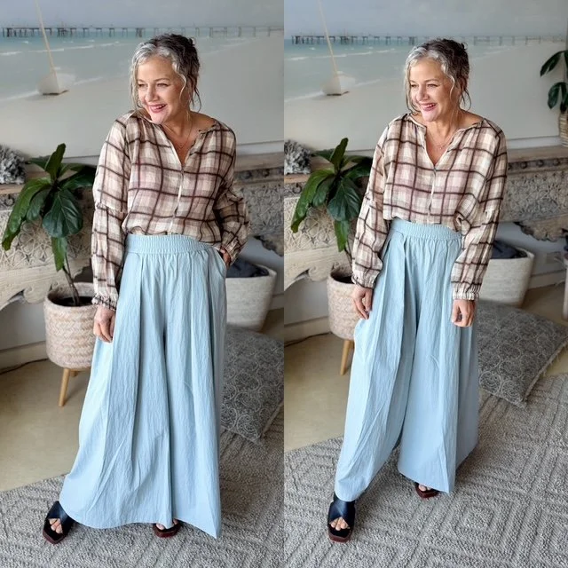
And an extra bonus for me as part of my Silver shift era, is Dark Taupe is one of my best Dark neutrals, and Light Blue is one of my best skin and hair highlighting colours.
Colour theory is one of the most exciting formulas to use when creating an outfit, and it's up to you how far you want to go into that space without making it seem too hard and making you give up.
Start with colours that suit each other first, then, as you build your best wardrobe over the years, narrow down to the colours that only suit you too.
And then as you evolve again and your hair and skin change, you can step more deeply into your Silver Shift energising colours.
It's fun to be able to evolve and have your wardrobe change as you change, but with a clear plan and a definite intention.
We simply learn more about ourselves, make more intentional choices, and build on what we already know.
Which Clutch Bag For Your Colour Type →
Nat xo