How to Mix Prints: The 3-Step Formula for Print Clashing
The 3-Tier Formula for Print Clashing
The formula for print clashing has three tiers, and the first is by far the easiest place to start.
Tier One: Find the Common Thread
The simplest way to mix two prints is to choose prints that share the same print formation, for example, stripes with stripes.

The secret is scale.
Make one print large in scale, and the other medium or small. This creates enough difference between the two prints for them to work together, rather than compete for attention.
Think: same language, different volume.
That’s what makes the clash feel intentional rather than chaotic.
Tier 2: Find the Colour Connection
The second tier is a little more adventurous.
Here, the prints have one or two colours in common, but the actual print formations are completely different. They are in friction with each other.
Think stripes with florals, sharp angles with soft curves, or checks with organic shapes.
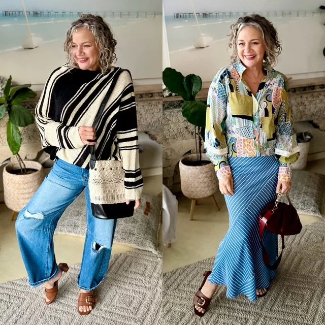
Tier 3: Let Colour Theory Do the Work
This is where it gets really fun!
Tier 3 is where we bring in colour theory and use colour combinations from my Brilliant Colour Combinations eBook (aka Coco) to create an outfit where the colours naturally enhance one another.
The prints are creating friction, the three different scales are working together, and the colours are having a little love affair with each other.

So while the prints might look like they shouldn't work together, the colour relationship brings everything back into harmony.
This is where print clashing stops looking accidental and starts looking seriously stylish.
SOME MORE WAYS TO GIVE THIS A TRY… →
Nat xo