Wearing Your Best Neutrals
Personal Neutrals: Print Layering Made Easy
Wearing your colours, the ones that actually reflect you, is one of the most flattering things you can do.
They’re natural, they put people at ease, and they make you feel like yourself.
These include your eye colour or your best eye enhancement colour (use the eye colour chart I sent you when you signed up for my style tips), then your skin colour, your best light neutral, and your best dark neutral (use your mood boards and coco eBook for these).
That's your core palette, and once you know it, print layering becomes a total art form.
Take this printed knit, for example, it’s been created with every colour type’s eye neutral woven in.
When you wear a print like this, your personal eye colour will be the one that stands out most near your face (because that’s how the eye works , it picks up on its own reflection).
You can level it up even more by layering another one of your best neutrals underneath with a shirt collar or lightweight hoodie in your skin tone, best light neutral, best dark neutral or even your best eye neutral again.
The underlayer can be in a solid item or feel free to create more drama by adding another print underneath.

Now, let’s talk bottoms.
This part takes a little more thought, but trust me, it’s so worth the effort to get right.
Here’s a tip I swear by: don’t repeat one of the colours from your print in a solid-colour bottom.
It can flatten the whole look, making your outfit look old-fashioned.
If you do want to echo one of the shades from your top, make sure your bottoms have something extra going on, like a print of their own texture or self-pattern (like my burgundy pants above).
That detail adds interest and keeps the outfit feeling intentional, not matchy-matchy.
Little things like this will take an outfit from ‘fine’ to fabulous.

Then there’s what we call “Close but Clever”, a term we use when a personal neutral is similar, but not exactly the same. Think navy versus washed navy.
These near matches work beautifully, especially when paired with a strong neutral in your print.
It’s a great way to get depth and variation in your outfits without looking like you are trying to directly match a colour in your print.
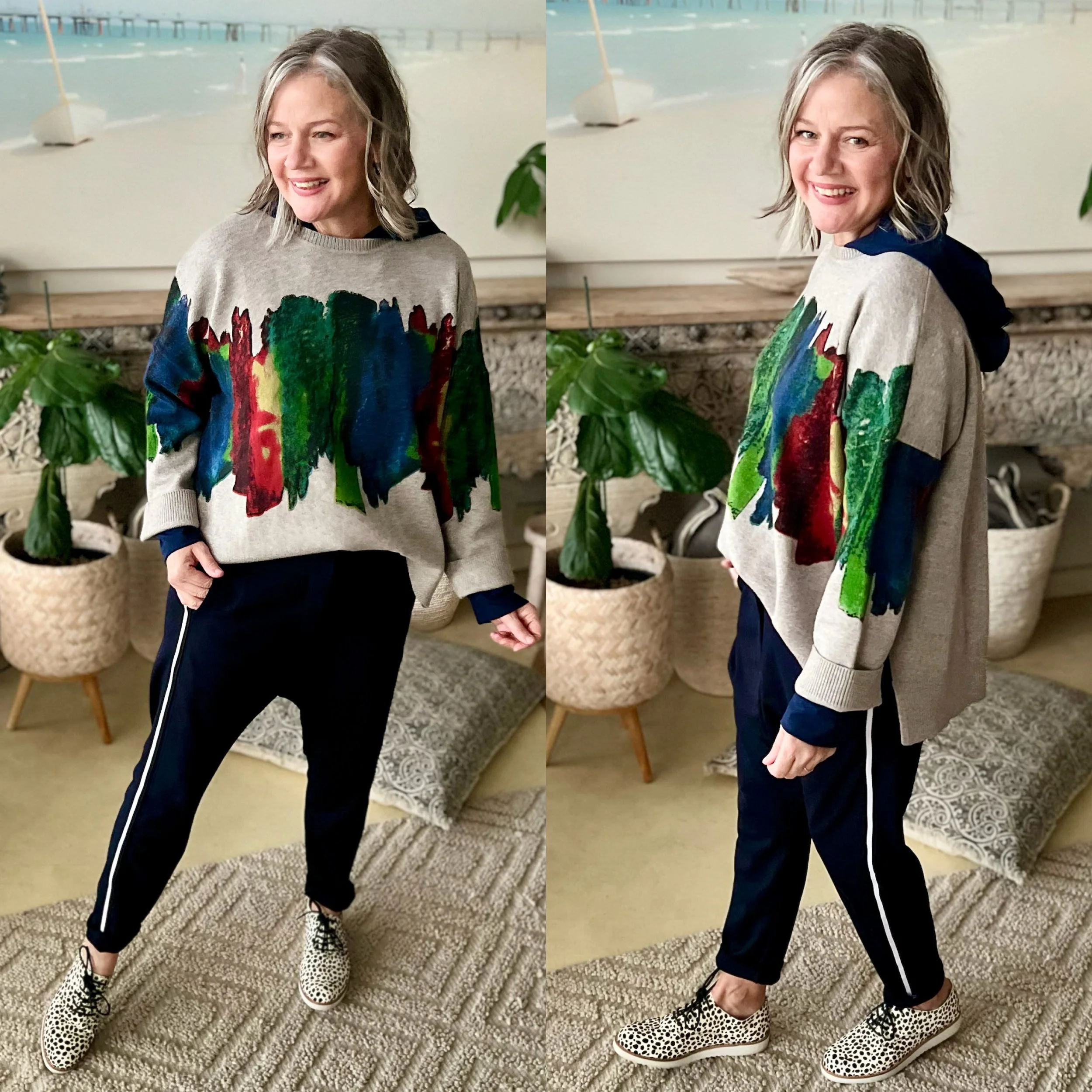
Or go “Print clash all the way!”
The trick?
Make sure your prints aren’t too similar in value or design.
Think: a soft, watercolour-style knit paired with a sharp side-stripe pair of pants, and then throw in a bold, smaller-scale leopard print shoe for good measure.
The contrast in scale and intensity is what makes it intentional and cool, not chaotic.
Playing with prints, especially when layered with your personal neutrals, adds energy, personality and that effortlessly styled edge to your outfits.
Nat xo