When Does A Print Act Like Mascara
Hold up, what does Nat mean when she talks about something being mascara (a slight visual highlight) rather than being a full dominant print that shouldn't be matched, only enhanced by a colour or used as a fabulous print clash?
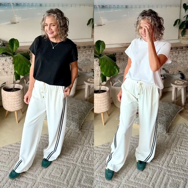
Let's begin looking at the example below. These ivory pants have a double black line (dominant) and a middle white stripe (mascara).
How can you tell the difference?
The black T-shirt looks as though you are trying to match the dominant stripe with your tee = old-fashioned.
And it falls flat.
Whereas the white T-shirt looks fresh and appears to be non-repeating to the white mascara middle stripe, like you aren't trying to match = so stylish.
The outfit feels fresher, lighter, and much more modern.
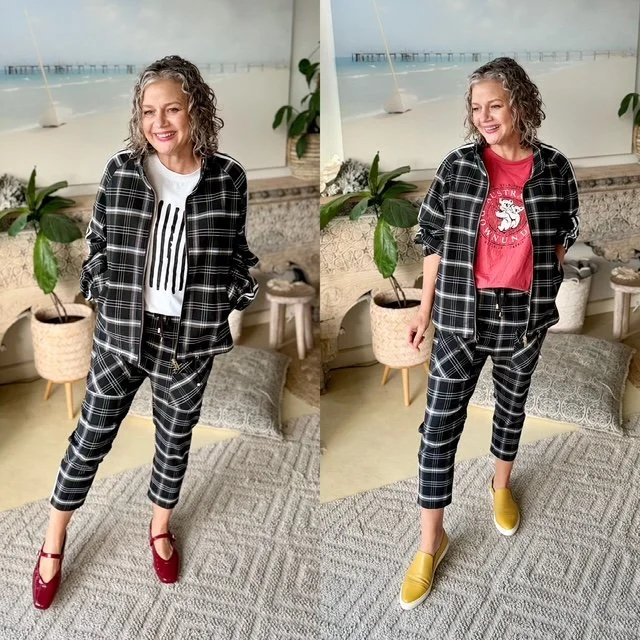
Then there are the no-shadow-of-a-doubt strong print items that want a direct print clash in black-and-white print as well, but at a different scale.
The first image below has the jacket and pants in a small scale print with the long sleeve tee being a large scale print (more negative space with a light neutral background).
Or you can go for a colour that works with black and white print {refresh that knowledge here}, either in a print or in a solid colour.
Once you understand the difference, you'll stop matching everything... and start creating outfits that feel effortlessly stylish.
Nat xo