Wearing Prints That Don’t Suit You
How to Wear a Print That Doesn’t Suit Your Colour Type
(Without Looking Like You’ve Borrowed From Someone Else’s Wardrobe)
Let’s talk about something quietly rebellious.
You know that print that technically… doesn’t suit you?
The one that’s sharper, louder, stronger, higher contrast than your natural colouring? But the garment itself? The cut? The design? The colour against your skin?
Stunning!
So now what?
Do we walk away because “stripes aren’t my best print”?
Absolutely not. We use a strategy.
When a Print Feels Foreign
Stripes will feel so foreign to Hair and Creative colour types as they are sharp. It will feel like you’re wearing someone else’s personality (and you are!).
Take a classic white and blue stripe.
It’s higher contrast.
It’s graphic with clear direction.
It’s crisp and clean lines.
If your colour type is that of a natural low contrast, that combination can feel jarring.
But stick with it.
Because that skirt, that shirt, that dress? It might bring an entirely new dimension to your wardrobe.
You just need to anchor it properly.
Step 1: Insert a “Middle Man” Colour
If the stripe feels strong, bring in a buffer. I love pairing mine with oatmeal.
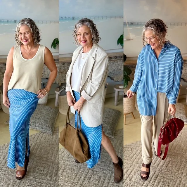
Oatmeal is the ultimate peacekeeper.
It softens contrast. It settles sharpness. It acts as the go-between.
This could be done with:
• An oatmeal tank
• A tee-shirt
• A lightweight knit
• A shirt
• A blazer
What you’re doing is lowering the visual temperature of the outfit.
You’re telling the stripe, “Calm down. We’re not at Fashion Week.”
This is especially helpful for women who don’t want to look like they’re trying too hard, but also don’t want to look invisible.
Step 2: Pair it with one of Your best prints
Now we stabilise. If stripes aren’t your best print, bring in one that is.
For example, if you are a Hair Romantic colour type, your best prints are:
• Watercolours
• Florals that still look like they’re growing on the vine
• Coloured animal print
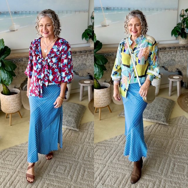
These prints feel natural on you. They soften your face. They make others feel at ease when speaking to you.
When you combine a “not my best” stripe with a “very me” blouse, you regain Boss status.
The outfit feels balanced instead of confusing. You feel like yourself again. All you need to do is make sure there is a colour in common to link them both.
Step 3: If you're feeling brave... Double down.
This one is fun. Try it with another stripe.
Yes. I said it.
Pair a horizontal stripe skirt with a vertical stripe shirt, but make sure they share a common colour.

For example: Blue with blue.
Not navy pretending to be blue. Actual blue.
This creates a print clash with both a pattern in common and a colour in common.
The different stripe directions create interest. The shared colour keeps it intelligent.
It’s dramatic. It’s cool. It will turn heads.
WARNING! - Only wear this vibe on a day when you don’t want people asking you for directions (you know what I'm saying here Hair Romatic colour types).
You will look like you know exactly where you’re going, and they can find their own way.
The Real Lesson Here
This isn’t about stripes.
It’s about understanding:
• Contrast
• Print sharpness
• And how to moderate visual intensity
You don’t need to avoid something just because it’s not technically your best.
You need to know how to support it.
And this is where women become powerful dressers.
Because once you understand: “Why doesn’t this feel right?”.
You can fix it in 30 seconds.
Add a buffer, add a familiar print or double down.
Done.
Nat xo