
The Colour Putty Versus Oatmeal and How You Can Tell Them Apart
The key to the perfect wardrobe is learning how colours work together, as well as on you (more on that at the bottom of this email) but just knowing how they work together will give you a streamlined wardrobe with nothing left out in the cold.
Let's have a little lesson on how effective this is... Most of you have my Brilliant colour combinations e book so this will help you use it even more efficiently.
Putty versus oatmeal.

When you see them both side by side like this (I'm using my brilliant colour combinations e-book on my iPhone here), you clearly see how different they really are.
So let's say I purchased a pair of medium grey pants (I do own two pairs in medium grey), it helps me to know that medium grey goes with oatmeal and not putty - Bam!
This knowledge directs me to return home and build a stack of outfits using oatmeal and the very hard-to-style medium grey (one of the hardest colours to make work in your wardrobe so I never recommend this colour other than on orange skin beauties who make it pop!).
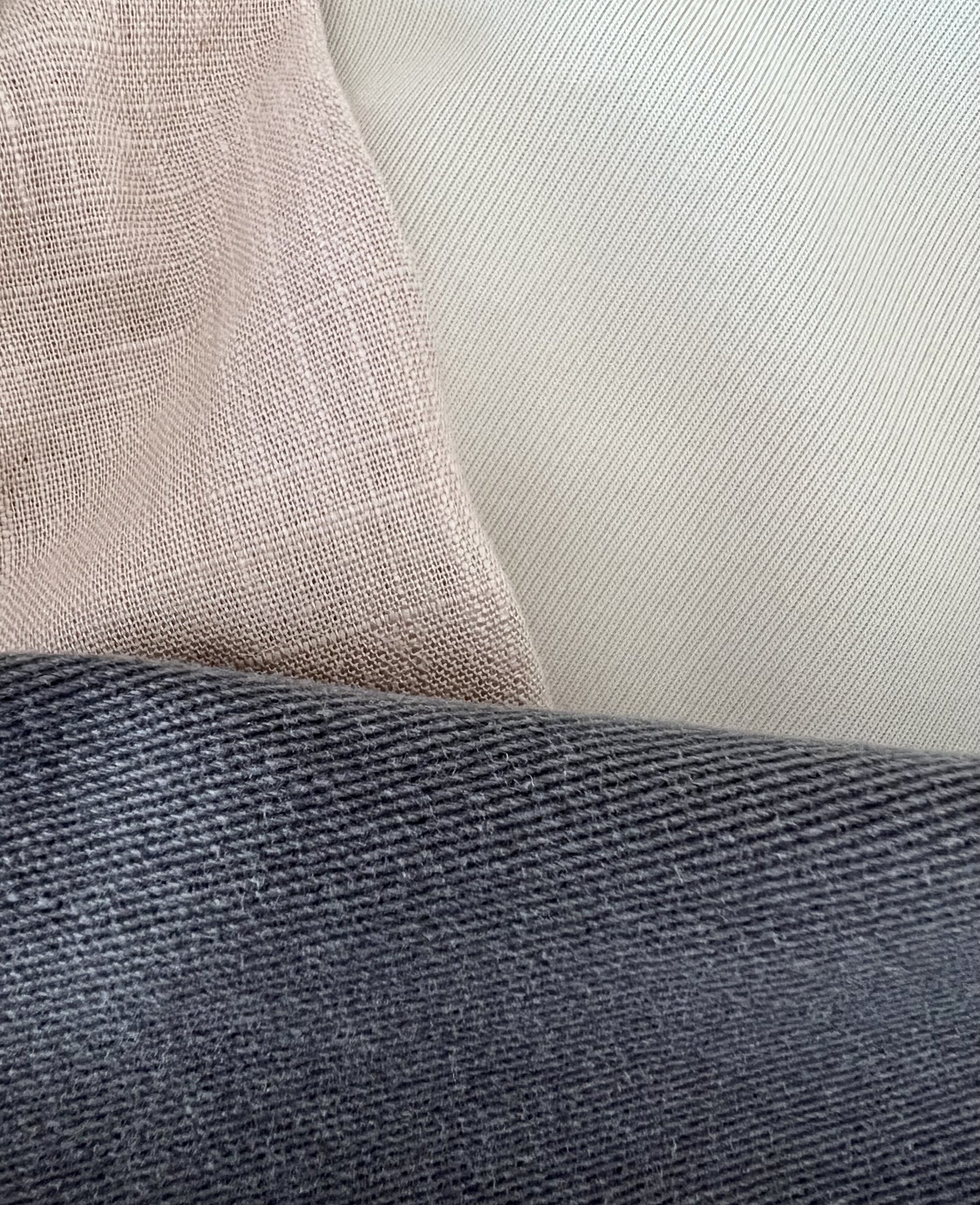
And camel looks fabulous with putty over oatmeal.
So if you were to put both putty and oatmeal besides medium grey and camel, you would watch as the undertone jumps out and shows itself to be the best colour enhancement partner for one or the other.
See if you can practice seeing undertones by finding the colours that don't work together over the ones that do. This is how you train your eyes (through practice) so it becomes completely natural.
Putty and Oatmeal both suit Pink and Peach skin tones while, while Orange skin tones only suit oatmeal and should avoid putty.
Blue skin tones work with neither and would be best to head for crisp white.
Right, now it's your turn to give this a go!

